
Perfectly Responsive Product Tables Across Every Device
Display responsive WooCommerce product tables that automatically adapt to desktops, tablets, and mobile devices, ensuring a smooth and consistent shopping experience for every customer.
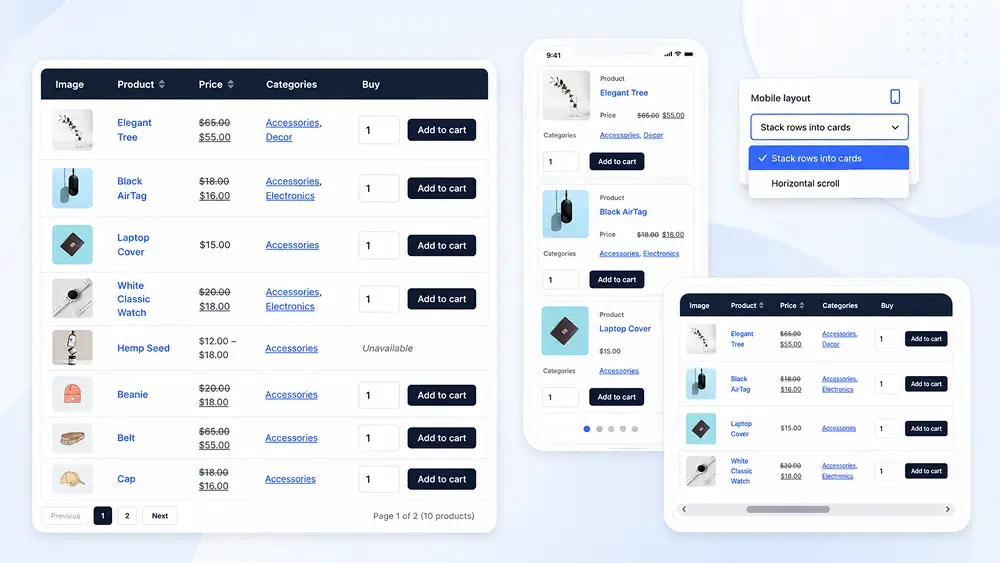
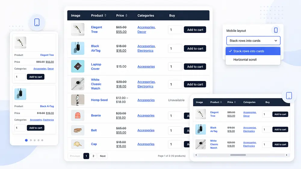
Optimize Product Tables for Every Screen Size and Device
Ensure your WooCommerce product tables look great on every device with fully responsive layouts. Automatically adjust table displays for desktops, tablets, and mobile devices without compromising usability or performance.
- Responsive Desktop Layout
- Optimized Tablet View
- Mobile Card Layout
- Automatic Screen Adaptation
- Touch-Friendly Interface
- Smooth Product Browsing
- Consistent User Experience
- Fast Responsive Performance
See Responsive Layout in Action
Watch the same WooCommerce product table automatically adapt across desktop, tablet, and mobile devices, providing a clean, user-friendly, and consistent shopping experience on every screen.
Key Benefits
Seamless Multi-Device Experience
Deliver a consistent shopping experience with product tables that automatically adapt to desktops, tablets, and mobile devices.
Better Customer Accessibility
Ensure customers can comfortably browse products and place orders regardless of the device they choose to use.
Improved Mobile Usability
Make browsing and purchasing easier with touch-friendly layouts designed specifically for smaller screens and mobile users.
Higher Engagement Across Devices
Responsive layouts encourage longer browsing sessions while helping customers complete purchases from any screen size.
Ready to Build Better WooCommerce Product Tables?
Create fast, responsive, and customizable product tables with Smart Product Tables. Improve product browsing, simplify ordering, and deliver a better shopping experience for your customers.