


When visitors can’t find what they’re looking for, they quickly lose interest and leave. Cluttered dropdowns or poor navigation can make even a great website frustrating to explore.
That’s where mega menus come in. They organize content clearly, making it easy for users to browse and find what they need without confusion.
In this article, you’ll learn how mega menus enhance website navigation, improve user experience, and help guide visitors toward key pages that boost engagement and conversions.
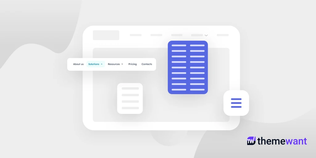
What Are Mega Menus
Mega menus are large dropdown panels that display multiple options in a well-structured layout. Unlike standard menus with limited space, mega menus show all major categories and subcategories at once.
They are especially useful for websites with extensive content, such as eCommerce stores, news portals, or educational platforms. A mega menu allows users to explore sections effortlessly without scrolling through endless lists or clicking multiple pages.
How Mega Menus Improve Website Navigation and Improve User Experience
Mega menus do more than make your website look sophisticated. They create a smoother, more enjoyable browsing experience. By simplifying navigation, organizing complex content, and supporting both usability and SEO, they ensure that visitors can explore your site with confidence and satisfaction.
i. Simplifying website navigation
When websites have a lot of content, finding specific pages can feel like searching for a needle in a haystack. Mega menus solve this by grouping related links into well-defined sections. This structure allows users to quickly identify where they need to go without endless clicking or backtracking. With fewer steps between landing on your site and finding the right page, visitors can move effortlessly through your content — leading to better engagement and longer browsing sessions.
ii. Enhancing the overall user experience
A great user experience starts with ease of use. Mega menus improve that by providing a visually clear and predictable navigation path. They minimize frustration by presenting choices logically and attractively. When users can instantly spot what they need—whether it’s a service, product, or blog category—they feel more in control. This sense of ease and efficiency encourages repeat visits and strengthens trust in your brand.
iii. Ideal for content-rich and eCommerce sites
Websites that offer a wide range of products or information benefit most from mega menus. For eCommerce stores, mega menus allow shoppers to browse by brand, category, or collection all within one view. For directories or content-heavy sites, they help organize large volumes of listings or resources into neat, accessible sections. This visual hierarchy keeps the site from feeling cluttered and prevents users from becoming overwhelmed by too many choices.
iv. Supporting SEO and accessibility
Mega menus also play a role in improving SEO and accessibility. Search engines use the internal links within your mega menu to crawl and index your site more effectively. This can improve visibility for deeper pages that might otherwise go unnoticed. From an accessibility standpoint, mega menus can be designed to support keyboard navigation and screen readers, ensuring that every user, regardless of ability, can explore your website comfortably.
Best Practices for Designing Mega Menus
Before you start designing a mega menu, it’s important to remember that its purpose isn’t just to look impressive; it’s to make navigation effortless. A well-structured mega menu should guide users naturally through your website without overwhelming them. Let’s explore the best practices for designing mega menus that balance usability, aesthetics, and performance.
Keep it simple and organized
Simplicity is the foundation of an effective mega menu. Even though you have plenty of space, resist the urge to cram in too many links. Instead, focus on organizing items into clear, logical categories. Use concise labels and limit each column to a manageable number of options. This prevents information overload and helps users scan quickly. A clean layout with adequate spacing ensures that visitors can find what they need without confusion or visual clutter.
Use clear and descriptive headings
Headings are the signposts of your mega menu. Each section should have a descriptive title that tells users exactly what they’ll find inside. Avoid vague labels like “More” or “Other.” Instead, use specific language such as “Women’s Accessories” or “Marketing Tools” to create instant clarity. When your headings make sense at a glance, users can navigate your site with confidence and purpose.
Prioritize important content
Not every link deserves the same level of attention. Place your most important or frequently visited pages in prominent positions within the mega menu. For example, an eCommerce site might highlight “New Arrivals” or “Top Deals,” while a directory website could showcase “Featured Listings” or “Popular Categories.” Visual cues like bold text or subtle icons can help draw attention to key areas without being distracting.
Incorporate visuals thoughtfully
Images and icons can make mega menus more engaging and easier to understand. However, they should enhance, not overpower, the design. Use small, relevant visuals to differentiate categories or highlight featured items. For instance, an online fashion store could display small thumbnails of clothing types. Keep file sizes light to ensure that the menu loads quickly and doesn’t slow down your site’s performance.
Ensure responsiveness and accessibility
Your mega menu should look and function flawlessly across all devices. On desktops, users expect hover or click-based expansion, but on mobile, a simplified collapsible version works best. Ensure keyboard navigation compatibility and include ARIA labels so that users with disabilities can explore your site easily. Accessibility should never be an afterthought; it’s an essential part of good UX design.
Maintain consistent styling
Consistency builds trust and helps users feel oriented. Make sure your mega menu follows your website’s overall design language, including color palette, typography, and button styles. When visual elements align, users perceive the site as more cohesive and professional. Subtle hover effects, shadows, or separators can add polish without distraction.
Test and refine regularly
Even the best-designed mega menu benefits from testing. Use analytics and heatmaps to understand which sections users interact with most. A/B testing can reveal whether changing labels, layouts, or order improves engagement. Regular updates ensure that your mega menu evolves with your content and remains relevant to user needs.
Conclusion
Mega menus play a vital role in enhancing website navigation and overall user experience. By organizing complex site structures into visually clear and easily accessible categories, they help users find what they’re looking for without frustration or endless scrolling. This not only reduces bounce rates but also encourages deeper site exploration.
When designed thoughtfully with intuitive layout, responsive design, and clear visual hierarchy, mega menus transform a cluttered website into a seamless browsing experience. Ultimately, they bridge the gap between functionality and aesthetics, guiding visitors effortlessly toward the content or products that matter most.

