















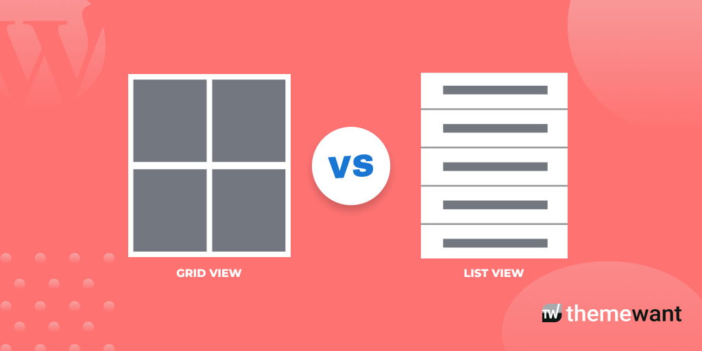
A blog’s layout does more than define its appearance. It shapes how readers discover content, navigate between articles, and interact with your website. Among the most popular blog designs, grid and list layouts offer two very different browsing experiences.
A grid layout emphasizes visuals and allows visitors to scan multiple posts quickly, while a list layout focuses on readability by displaying titles, excerpts, and additional content details.
Choosing the right layout can influence user experience (UX), engagement, page views, mobile usability, and even search engine optimization (SEO).
In this blog post, we’ll compare grid vs list layouts, explore their advantages and disadvantages, and help you determine which design best matches your blog’s content strategy and audience.
What Is a Blog Layout?
A blog layout is the way your blog organizes and presents content to visitors. It determines how blog posts, images, headlines, categories, navigation menus, and other page elements are arranged on the screen. While the layout contributes to the visual design of a website, its primary purpose is to make content easy to find, read, and explore.
Think of your blog layout as the blueprint of your website. Even if you publish valuable, well-researched articles, a poor layout can make it difficult for readers to locate relevant content or continue browsing. On the other hand, a well-structured layout encourages visitors to stay longer, view more pages, and engage with your content.
Why does blog layout matter?
The layout you choose affects several aspects of your website, including:
- User Experience (UX): A clean, organized layout helps visitors navigate your blog without confusion.
- Content Discovery: Readers can quickly find related articles, categories, or featured content.
- Readability: Proper spacing, typography, and content arrangement make articles easier to consume.
- Engagement: An intuitive layout encourages users to click on more posts, increasing page views and session duration.
- Mobile Responsiveness: Since a large portion of web traffic comes from smartphones, your layout should adapt seamlessly to different screen sizes.
- SEO Performance: While search engines don’t rank websites based solely on layout, a better user experience, lower bounce rate, improved Core Web Vitals, and stronger engagement can positively influence search performance.
Common types of blog layouts
Although websites use many design variations, most blogs rely on one of these content layouts:
- Grid Layout: Displays blog posts in multiple columns with featured images, creating a visually appealing gallery-like experience.
- List Layout: Shows posts one after another with larger titles, excerpts, metadata, and sometimes featured images, making it easier for readers to evaluate each article.
- Hybrid Layout: Combines both approaches, often featuring highlighted articles in a grid while listing recent posts below.
Among these options, grid and list layouts remain the most widely used because they balance aesthetics, usability, and content organization. The right choice depends on your blog’s niche, publishing style, audience behavior, and business goals.
Understanding the Grid Layout
A grid layout organizes blog posts into multiple columns, with each article displayed as a card containing a featured image, title, and sometimes a short excerpt or category label. Instead of presenting posts in a single vertical stream, a grid allows visitors to view several articles at once, making it easier to scan through content quickly.
This layout is popular among blogs that rely heavily on visuals because it creates an attractive, modern appearance while maximizing the number of posts visible on the screen.
How does a Grid Layout work?
In a typical grid layout, each blog post appears as an individual card with consistent spacing and dimensions. Depending on the screen size, the number of columns changes automatically through responsive design.
For example:
- Desktop: Three or four columns
- Tablet: Two columns
- Mobile: One column
This responsive behavior ensures the layout remains easy to browse across different devices.
Key features of a Grid Layout
A grid layout usually includes:
- Featured images for every blog post
- Short, clickable titles
- Optional post excerpts
- Category labels or tags
- Author name and publication date
- Uniform card design
- Responsive column structure
These elements work together to create a visually balanced browsing experience.
Advantages of a Grid Layout
1. Visually appealing design
The biggest strength of a grid layout is its visual impact. High-quality featured images immediately capture attention and encourage users to explore your content.
For blogs in creative industries such as travel, food, photography, fashion, or interior design, visuals often communicate value before readers even click on an article.
2. Displays more content at once
Unlike a list layout that may show only a few articles before users begin scrolling, a grid can present many posts within the same screen area.
This allows readers to compare multiple topics quickly and choose the one that interests them most.
3. Encourages content discovery
Since visitors can see numerous articles simultaneously, they’re more likely to discover older or less prominent posts that might otherwise remain unnoticed.
This can increase:
- Internal page views
- Time on site
- User engagement
4. Excellent for image-based blogs
If your content depends on visuals, a grid layout showcases featured images effectively.
Examples include:
- Photography blogs
- Recipe websites
- Travel blogs
- DIY projects
- Home décor blogs
- Fashion magazines
In these niches, images often influence click-through rates more than headlines alone.
5. Creates a modern appearance
Many contemporary websites adopt card-based grid designs because they look clean, organized, and professional.
A consistent card layout also helps establish brand identity while keeping the homepage uncluttered.
Disadvantages of a Grid Layout
Despite its strengths, a grid layout isn’t the best choice for every blog.
1. Limited space for information
Each card has limited room for titles and excerpts.
Long headlines may wrap awkwardly, while short descriptions may not provide enough context for readers to understand what an article covers.
2. Can reduce readability
Readers seeking detailed information often prefer seeing longer excerpts before deciding to click.
A grid layout emphasizes visuals over text, which may not suit educational or research-focused blogs.
3. Depends on high-quality images
Without attractive featured images, a grid layout can appear repetitive or unprofessional.
Blogs that publish mostly text-based content may struggle to maintain visual consistency.
4. Potential performance issues
Image-heavy grids can increase page size and loading time if images aren’t optimized.
To maintain performance:
- Compress images
- Use modern formats like WebP or AVIF
- Enable lazy loading
- Serve responsive image sizes
These optimizations improve Core Web Vitals and provide a smoother browsing experience.
5. Accessibility challenges
Poor color contrast, image-only cards, or missing descriptive alt text can make a grid layout less accessible for users relying on screen readers or keyboard navigation.
Following accessibility best practices ensures every visitor can navigate your content effectively.
SEO impact of a Grid Layout
A grid layout doesn’t directly improve search rankings. However, it can indirectly support SEO by enhancing user engagement when implemented correctly.
A well-optimized grid layout can help:
- Increase click-through rates on internal posts
- Improve content discovery
- Encourage visitors to explore more pages
- Reduce abandonment through better navigation
- Support mobile-friendly browsing
However, oversized images, slow loading times, or poor responsiveness can negatively affect user experience and Core Web Vitals, limiting these benefits.
Best use cases for a Grid Layout
A grid layout works best for blogs that rely on visual storytelling or publish content that benefits from image-first browsing.
It’s an excellent choice for:
- Travel blogs
- Photography websites
- Food and recipe blogs
- Fashion and beauty blogs
- Lifestyle blogs
- Architecture and design websites
- Entertainment and magazine-style publications
- Portfolio websites
These types of blogs naturally attract readers through compelling visuals, making a grid layout an effective way to showcase content.
When should you choose a Grid Layout?
A grid layout is a smart choice if your goals are to:
- Highlight featured images
- Showcase a large collection of articles
- Create a modern, visually engaging homepage
- Encourage visitors to browse multiple posts
- Build a magazine-style reading experience
However, if your blog focuses on detailed tutorials, technical documentation, or long-form educational content, a list layout may provide a better reading experience.
Understanding the List Layout
A list layout presents blog posts in a single vertical column, displaying each article one after another. Unlike a grid layout that prioritizes visuals, a list layout gives more space to headlines, featured images, excerpts, author information, publication dates, and other metadata. This allows readers to understand what an article is about before deciding to click.
Because of its simplicity and readability, the list layout is widely used by news websites, educational blogs, technology publications, and businesses that publish long-form content.
How does a List Layout work?
In a list layout, every blog post appears as an individual content block. Each block typically includes:
- A featured image (optional)
- The blog post title
- A short excerpt or summary
- Author name
- Publication date
- Category or tags
- A “Read More” button or link
Since posts are stacked vertically, visitors naturally scroll through the page, evaluating one article at a time.
Key features of a List Layout
A standard list layout often includes:
- Single-column design
- Larger headlines
- Longer post excerpts
- Featured images with flexible sizing
- Clear typography and spacing
- Post metadata
- Easy-to-read navigation
This structure helps readers focus on content rather than visual elements.
Advantages of a List Layout
1. Better readability
The biggest advantage of a list layout is readability.
Longer titles and descriptive excerpts provide enough context for readers to determine whether an article matches their interests. Instead of relying solely on images, users can make informed decisions based on the content preview.
This is especially valuable for blogs covering technical, educational, or research-based topics.
2. Improves content discovery through context
Unlike a grid layout, which often limits descriptions to a few words, a list layout allows you to display meaningful excerpts.
These summaries help visitors:
- Understand the article’s purpose
- Compare similar topics
- Find answers more quickly
- Explore related content
The additional context often leads to higher-quality clicks because users know what to expect before opening the article.
3. Supports long-form content
Blogs that publish in-depth guides, tutorials, case studies, or industry insights benefit greatly from a list layout.
Readers interested in informative content usually value clear headlines and summaries more than visual presentation.
4. Easier to scan on mobile devices
Most websites receive a significant portion of their traffic from smartphones. A single-column list layout naturally adapts to smaller screens without requiring major design adjustments.
Visitors can scroll comfortably without dealing with crowded cards or inconsistent image sizes.
5. Better accessibility
A well-structured list layout often provides a better experience for users relying on assistive technologies.
Clear headings, logical reading order, sufficient spacing, and descriptive links improve navigation for screen readers and keyboard users.
Disadvantages of a List Layout
Although highly practical, a list layout has some limitations.
1. Shows fewer posts initially
Because each article occupies more vertical space, visitors see fewer posts before scrolling.
This can reduce the visibility of older articles, particularly on blogs with large content libraries.
2. Less visually engaging
Compared to a grid layout, a list design may appear plain or repetitive, especially if featured images are small or absent.
For image-driven blogs, this can reduce visual appeal.
3. Requires more scrolling
Readers may need to scroll farther to discover additional content.
While continuous scrolling has become common, some users prefer seeing multiple options immediately, as they would in a grid layout.
4. Can feel text-heavy
If excerpts are too long or formatting is inconsistent, the page may feel overwhelming.
Using concise summaries, clear headings, and generous white space helps maintain readability.
SEO impact of a List Layout
Like a grid layout, a list layout doesn’t directly influence search engine rankings. However, it can contribute to stronger SEO performance by improving user experience and engagement.
A well-designed list layout can help:
- Increase average time on page
- Improve readability
- Encourage users to explore related articles
- Reduce confusion during navigation
- Enhance mobile usability
- Support accessibility best practices
Because visitors receive more information before clicking, they may engage more deeply with content that matches their search intent.
Best use cases for a List Layout
A list layout works particularly well for blogs where readers seek information rather than visual inspiration.
It’s commonly used by:
- Technology blogs
- Digital marketing websites
- Business blogs
- Educational platforms
- News publications
- Software documentation websites
- Finance blogs
- Health and medical blogs
- Personal development websites
These blogs prioritize detailed information, making readability more important than image-focused design.
When should you choose a List Layout?
A list layout is an excellent choice if your primary goals are to:
- Improve readability
- Publish long-form articles
- Provide detailed content previews
- Help readers find information quickly
- Create an accessible and distraction-free experience
- Support content-heavy SEO strategies
If your blog focuses on tutorials, industry insights, case studies, or informational articles, a list layout often delivers a better experience than a purely visual grid design.
Now that we’ve explored both layouts individually, it’s time to compare them side by side.
Grid vs. List Layout: Side-by-Side Comparison
Both grid and list layouts can create an excellent user experience when implemented correctly. The better choice depends on your content type, audience behavior, and website goals. Rather than asking which layout is universally better, it’s more useful to evaluate how each performs across key aspects of usability, design, and SEO.
The following comparison highlights the strengths and weaknesses of each layout.
| Feature | Grid Layout | List Layout |
|---|---|---|
| Visual Appeal | High. Displays multiple posts with eye-catching images. | Moderate. Focuses more on text and readability than visuals. |
| Readability | Good for short titles and quick browsing. | Excellent for detailed headlines and excerpts. |
| Content Discovery | Allows users to view many posts at once. | Helps users understand each article before clicking. |
| User Experience (UX) | Best for visual exploration. | Best for focused reading and information discovery. |
| Mobile Experience | Works well with responsive cards but depends on image optimization. | Naturally adapts to smaller screens with a single-column structure. |
| SEO Benefits | Encourages exploration through visual navigation. | Improves engagement through clearer content previews. |
| Loading Performance | Can be slower if images are not optimized. | Typically lighter and faster when using fewer or smaller images. |
| Best For | Photography, travel, fashion, food, lifestyle, magazines. | Technology, education, business, news, tutorials, documentation. |
Readability
Readability is one of the biggest differences between these two layouts.
A grid layout provides only a limited amount of space for each post. Titles are usually shorter, and excerpts may be omitted entirely. This design works well when images tell much of the story, but it offers less context for text-heavy content.
A list layout, on the other hand, gives readers more information before they click. Longer headlines, summaries, and metadata help visitors quickly decide whether an article matches their needs.
Winner: List Layout
User experience (UX)
A good user experience depends on how easily visitors can find relevant content.
A grid layout allows users to scan many articles simultaneously, making browsing feel fast and engaging. This is ideal for readers who enjoy exploring different topics visually.
A list layout supports a more deliberate reading experience. Visitors move through content one article at a time, making it easier to evaluate each post.
Choose a grid layout if your audience prefers browsing.
Choose a list layout if your audience typically arrives with a specific question or problem to solve.
Winner: Depends on user intent
Content discovery
Content discovery refers to how easily users find additional articles on your website.
A grid layout increases visibility by displaying many posts within a limited screen area. Readers often discover older content they might otherwise miss.
A list layout provides richer previews that help visitors choose articles based on relevance rather than appearance.
Both layouts improve content discovery in different ways:
- Grid encourages exploration.
- List encourages informed decision-making.
Winner: Tie
Visual appeal
If aesthetics are your priority, a grid layout has a clear advantage.
Large featured images, balanced spacing, and card-based designs create an attractive homepage that encourages clicks.
A list layout appears cleaner and more professional but generally places less emphasis on visual presentation.
For brands where photography or design plays a significant role, the grid layout creates a stronger first impression.
Winner: Grid Layout
Mobile responsiveness
Modern blog themes usually optimize both layouts for smartphones.
A responsive grid automatically reduces multiple columns into a single-column layout on smaller screens. However, image-heavy pages require careful optimization to avoid slower loading times.
A list layout naturally fits mobile devices because content already appears in a single vertical column.
Both layouts can perform well on mobile when designed responsively.
Winner: List Layout (slight advantage)
Loading performance
Website speed affects both user experience and SEO.
Grid layouts often load more featured images simultaneously, increasing page size if those images aren’t compressed or lazy-loaded.
List layouts typically use fewer large images and therefore consume less bandwidth.
Regardless of the layout you choose, optimize:
- Image dimensions
- File formats (WebP or AVIF)
- Lazy loading
- Browser caching
- Content delivery networks (CDNs)
These practices improve Core Web Vitals and reduce loading times.
Winner: List Layout
Accessibility
Accessibility ensures every visitor can use your website regardless of ability.
A well-designed list layout generally offers:
- Better reading order
- Easier keyboard navigation
- Clear heading hierarchy
- Improved screen reader compatibility
Grid layouts can also be highly accessible, but they require careful implementation, including descriptive alt text, logical focus order, and sufficient contrast.
Winner: List Layout
User engagement
Engagement measures how visitors interact with your website through clicks, page views, scrolling, and time on site.
A grid layout often increases curiosity because users see multiple articles simultaneously.
A list layout may generate more intentional clicks since visitors understand each article before selecting it.
The better performer depends on your audience:
- Entertainment blogs often benefit from a grid layout.
- Educational blogs often benefit from a list layout.
Testing both layouts with analytics tools is the best way to determine what resonates with your readers.
Winner: Depends on audience behavior
SEO comparison
Many bloggers wonder whether Google prefers one layout over the other.
The answer is simple:
Google does not rank pages based on whether they use a grid or list layout.
Instead, search engines evaluate factors such as:
- Content quality
- Search intent satisfaction
- Mobile friendliness
- Core Web Vitals
- Internal linking
- Accessibility
- User experience
If either layout helps visitors find valuable content quickly and keeps them engaged, it can indirectly contribute to better SEO performance.
Which Layout Wins?
There’s no universal winner because each layout serves different purposes.
Choose a Grid Layout if you:
- Publish image-rich content
- Want a modern, magazine-style homepage
- Showcase portfolios or creative work
- Encourage visual browsing
Choose a List Layout if you:
- Publish long-form educational articles
- Focus on tutorials or documentation
- Prioritize readability
- Want to provide detailed content previews
For many blogs, the most effective solution isn’t choosing one over the other—it’s combining both. A hybrid layout can showcase featured content in a grid while presenting recent or in-depth articles in a list, giving readers the best of both experiences.
Final Thoughts
Choosing between a grid and list layout ultimately depends on your blog’s content, target audience, and overall goals. A grid layout is ideal for visually driven websites that want to showcase multiple posts at once, while a list layout is better suited for blogs that prioritize readability and detailed content previews. Neither option is inherently better, as each serves a different purpose and creates a unique browsing experience.
From an SEO standpoint, your layout alone won’t determine your search rankings. What truly matters is delivering a fast, mobile-friendly, and user-focused experience with high-quality content. Optimizing page speed, Core Web Vitals, navigation, accessibility, and internal linking will have a far greater impact on your blog’s performance than choosing a grid or list design.
If you’re still undecided, consider testing both layouts or using a hybrid approach that combines their strengths. Analyze user behavior, engagement metrics, and conversion data to understand what resonates with your audience. The best blog layout is the one that makes your content easy to discover, enjoyable to read, and encourages visitors to return for more.
